Industry observations frequently highlight a common challenge: many otherwise stunning homes often fall victim to easily avoidable interior decor mistakes. While the insightful video above pinpoints three critical errors that can undermine a room’s aesthetic, a deeper dive into these common blunders reveals how subtle shifts in approach can dramatically elevate your living spaces. Let’s unpack these significant interior design mistakes, moving beyond surface-level observations to master the nuances of expert-level styling.
The Peril of Poor Proportion: Mastering Scale in Interior Design
The very first and arguably most common decor mistake, as the video notes, revolves around scale. Entering a space where furniture seems either swallowed by vastness or bursting at the seams creates an immediate sense of disharmony. Achieving the correct scale is fundamental to crafting a room that feels balanced and intentionally designed.
Understanding Spatial Dynamics and Visual Weight
Scale isn’t merely about whether a sofa fits through the door; it’s about how each piece relates to the overall room dimensions and to other elements within that space. An oversized sectional can overwhelm a compact living area, making it feel cramped and impenetrable. Conversely, petite furniture in a spacious room can look lost, failing to anchor the zone it’s intended to define.
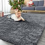
Imagine if your sofa, while perfectly comfortable, was visibly too small for your primary living area. This mismatch creates an unsettling visual void around it, diminishing its presence and functionality. The goal is to ensure each item carries appropriate visual weight, commanding attention without monopolizing it.
The Critical Role of Area Rugs and Layout
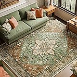
A frequently overlooked aspect of scale pertains to area rugs, often chosen based on budget rather than spatial necessity. An undersized rug can make a seating arrangement appear to float aimlessly in the middle of a room, disconnecting the individual pieces. It creates what designers term the “postage stamp” effect, leaving vast, cold expanses of bare floor around it.
Conversely, a properly scaled area rug effectively grounds a furniture grouping, drawing disparate elements together into a cohesive conversation zone. Ideally, at least the front two legs of all main seating pieces should rest on the rug, or for a truly luxurious feel, all legs should be within its boundaries. This simple adjustment fundamentally alters the perceived dimensions and unity of a space.
Achieving visual balance across a room also ties into scale. One side crammed with large, heavy pieces while the opposite remains sparse creates an uncomfortable asymmetry, despite any attempts at equalizing objects. Consider the cumulative visual weight; a large bookcase and a substantial armchair on one side might require a larger, perhaps even two-seater, sofa opposite, rather than a lone accent chair.
The experienced eye quickly discerns these proportional missteps, which disrupt the natural flow and comfort of a room. Planning layouts using painter’s tape to outline furniture footprints on the floor can be an invaluable, simple technique to visualize scale before making costly purchases.
Beyond Monochromatic: Crafting Nuanced Color Palettes
The video correctly identifies the “matchy-matchy” color scheme as a significant design faux pas. While a cohesive color story is desirable, a room where every element — from the rug to the pillows and the artwork — echoes an identical hue often feels flat, uninspired, and frankly, dated. This approach stifles individuality and prevents a space from feeling collected and layered.
The Subtlety of Chromatic Harmony
True sophistication in color application lies not in strict uniformity, but in chromatic harmony. This involves working with a diverse palette of tones, tints, and shades within a chosen color family, complemented by carefully selected accent colors. Instead of a single “theme color,” envision a sophisticated color story that unfolds through variations and contrasts.
Consider a space aiming for a serene blue aesthetic. Instead of an identical blue rug, blue sofa, and blue art, an expert might introduce a deep navy sofa, a rug with subtle teal and grey undertones, and artwork featuring cobalt and cerulean alongside warmer neutrals. This layered approach creates depth and visual interest, allowing the eye to discover new subtleties.
The Power of Texture and Pattern in Color Play
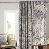
Another common misstep is neglecting the role of texture and pattern in enriching a color scheme. Identical colors on different textures — a velvet pillow versus a linen curtain of the same shade — interact with light differently, creating natural variations. Pattern, too, can introduce multiple colors within a cohesive design, adding vibrancy without overwhelming the space.
Imagine if a room strictly adhered to a single shade of beige across all soft furnishings. The result would be bland, lacking energy and personality. Now, envision the same beige room with a chunky knit throw, a silk cushion, and a patterned rug incorporating cream and a soft taupe. The underlying beige remains, but the textures and patterns inject life and complexity, making the space feel rich and inviting.
Expert designers often employ the 60-30-10 rule: 60% dominant color, 30% secondary color, and 10% accent color. This framework allows for intentional variation, ensuring balance without monotony. It’s about building a rich tapestry of color rather than painting with a single, broad stroke.
The Art of Dynamic Modernism: Blending Forms and Textures
The third common decor mistake highlighted in the video addresses the misconception of modern design: a tendency towards rigidity and uniformity, believing sleek, linear pieces alone define modernity. While clean lines are characteristic, true modern design, particularly contemporary interpretations, embraces dynamic contrasts and a blend of forms to prevent a cold, uninviting aesthetic.
Beyond the Linear: The Appeal of Mixed Forms
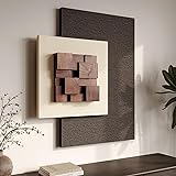
A room populated solely by rectilinear furniture – sharp corners, straight edges, hard surfaces – can indeed feel stark and unyielding. This overlooks the inherent human preference for variety and softness. Sophisticated modern spaces often achieve their impact through the intentional juxtaposition of forms: curvilinear elements against their linear counterparts.
Picture a living room dominated by a rectangular sofa, a square coffee table, and a boxy media unit. The repetition of sharp angles can make the space feel unwelcoming. Now, imagine introducing a soft, organically shaped accent chair, a round ottoman, or an abstract, flowing piece of art. These additions break the visual monotony, injecting warmth and a sense of effortless modernity.
Layering Textures for Tactile Richness
The “too uniform” mistake also extends to texture. Relying solely on smooth, polished, or hard surfaces in a modern design can strip a room of its tactile dimension. Modernism at its best integrates a variety of textures to create a multi-sensory experience, adding depth and coziness without sacrificing clean aesthetics.
Consider a space with polished concrete floors, glass tables, and chrome accents. While undeniably sleek, it risks feeling sterile. Introducing a plush wool rug, a boucle upholstered chair, a linen throw, or wooden elements instantly softens the visual and tactile landscape. These varied textures invite interaction and make the room feel more lived-in and comfortable.
The goal is not to abandon the modern aesthetic, but to evolve it. By thoughtfully mixing shapes—a sleek rectangular console paired with a sculptural, curved vase—and layering textures—a smooth leather sofa complemented by a nubby knit cushion—you create a dynamic environment. This approach ensures your modern room feels both avant-garde and inviting, a testament to sophisticated interior design.
Rescuing Your Room: Decor Q&A
What does ‘scale’ mean in home decor?
Scale refers to how the size of furniture and decor items relates to the overall room dimensions and to other items in the space. It helps ensure that no single piece looks too big or too small for its surroundings.
How should an area rug be placed to connect furniture in a room?
Ideally, at least the front two legs of all main seating pieces should rest on the rug. This helps ground the furniture and brings disparate elements together into a cohesive zone.
Why shouldn’t all my decor pieces match perfectly in color?
Having every item in a room match an identical hue can make the space feel flat, uninspired, and dated. True sophistication in color comes from using a diverse palette of tones, tints, and shades.
How can I make a modern room feel more inviting and less rigid?
To make a modern room feel more welcoming, mix different forms by combining sleek, linear furniture with softer, curvilinear pieces. Also, layer various textures like plush rugs, soft throws, and wooden elements to add depth and coziness.