Have you ever walked into a room, meticulously decorated, yet felt that something was subtly amiss? Perhaps the furniture was exquisite, the color palette cohesive, but a nagging sense of imbalance lingered, leaving the space feeling somehow unfinished. As highlighted in the insightful video above, one of the most pervasive missteps in home aesthetics often boils down to a fundamental principle: incorrect scale, particularly with wall decor.
Many homeowners, even those with an intuitive eye for design, frequently select wall art that is disproportionately small for its intended placement. This often leads to a visual void, prompting the mistaken belief that more, equally small items are needed to fill the gap. In reality, the core issue isn’t a lack of quantity, but a misunderstanding of scale, where the individual pieces or collection fail to command the visual presence required by the surrounding elements. Understanding and mastering the principle of scale is paramount to achieving a sophisticated, harmonious interior, transforming a good room into a truly exceptional one.
1. The Undeniable Power of Scale in Interior Design
The principle of scale in interior design refers to the relationship between the size of objects or elements within a space, and their relationship to one another, as well as to the overall room dimensions. When elements are in proper scale, they contribute to a sense of visual harmony and balance, making a room feel thoughtfully composed. Conversely, a deviation from appropriate scale, such as undersized artwork, can create discord, causing the space to feel either sparse and cavernous or overwhelmingly cluttered. A well-scaled room achieves a natural ebb and flow, guiding the eye through its various focal points without jarring interruptions.
Psychologically, correct scale influences how we perceive comfort and sophistication within an environment. Research from architectural psychology suggests that spaces with well-proportioned elements contribute to a heightened sense of well-being and visual satisfaction. An undersized piece of art on a large wall can make the wall itself feel even more vast and intimidating, reducing the artwork’s impact to a mere postage stamp. Conversely, a grand, appropriately scaled piece establishes a powerful focal point, grounding the room and dictating its visual narrative with authority and presence.
2. Decoding the 60-75% Rule for Art Placement
A cornerstone of effective art placement, and a critical point underscored in the video, is the widely accepted 60-75% rule. This guideline posits that the collective width of your artwork, whether a single piece or a curated collection, should ideally span between 60% and 75% of the width of the furniture it is hung above. For instance, if you have a 7-foot (84-inch) sofa, your art arrangement should occupy a visual width ranging from approximately 50 to 63 inches. This ratio ensures the artwork is visually grounded by the furniture, preventing it from appearing as if it’s floating aimlessly on the wall.
To accurately apply this principle, begin by measuring the width of the furniture beneath where the art will hang. This could be a sofa, a console table, a credenza, or a headboard. Then, calculate 60% and 75% of that measurement to establish your target width range for the art. Remember, this applies to the overall visual footprint of the art, so for gallery walls, this is the entire group’s width, including the negative space between pieces. This pragmatic approach eliminates guesswork and provides a clear, data-driven methodology for achieving professional-grade wall decor placement.
3. Beyond the Sofa: Applying Scale Across Your Home
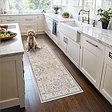
While the sofa-and-art scenario is a classic example, the 60-75% rule and the broader principles of scale extend to nearly every area of your home. Consider your bedroom: artwork above a king-sized headboard should be substantial enough to balance the visual weight of the bed. A common mistake is a small print barely covering the width of a single pillow, which completely diminishes its impact and makes the bed appear even larger and heavier by contrast. Instead, aim for a piece or grouping that aligns with the headboard’s width, maintaining that crucial proportional relationship.
Moreover, in an entryway, a console table often serves as a practical surface and a design anchor. The art or mirror placed above it should similarly occupy 60-75% of the console’s width to create a cohesive vignette. For walls without furniture, consider the entire wall as a design zone. If you have a particularly large, empty wall, a single, monumental piece of art can be a powerful statement. Alternatively, a carefully planned gallery wall that occupies a significant portion of the wall, respecting its vertical and horizontal dimensions, can also provide necessary visual weight and interest, preventing the space from feeling cavernous.
The Visual Weight Factor: It’s Not Just Size
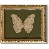
It’s important to recognize that “scale” is not solely about physical dimensions; visual weight also plays a significant role. Visual weight refers to how much an object draws the eye, influenced by factors like color saturation, texture, framing, and even subject matter. A relatively smaller piece with a dark, heavy frame and intricate detailing might possess more visual weight than a larger, unframed, minimalist print. Designers often leverage this nuance, combining different elements to achieve the desired balance, even if the strict dimensional ratios are slightly adjusted to accommodate for visual impact.
For example, a series of three relatively small, yet deeply saturated abstract paintings framed in dark wood might together achieve the necessary visual weight for a space, even if their combined physical width is slightly less than 60% of the furniture below. The intensity of their color and the substantial frames contribute to a more profound presence. Therefore, while the 60-75% rule provides an excellent quantitative baseline, a qualitative assessment of visual weight ensures that the artistic elements truly resonate within the overall design scheme.
4. Common Pitfalls and How to Avoid Them
The primary pitfall, as the video expertly illustrates, is undersized wall decor. This often stems from a desire to fill a space quickly or an underestimation of the sheer visual capacity of a large wall. Another frequent error is hanging art too high. Even if the width is appropriate, art placed too close to the ceiling can feel disconnected from the furniture and the human scale of the room, creating an awkward visual disconnect. A good rule of thumb is to center the artwork at eye level for standing adults (typically 57-60 inches from the floor) in areas like hallways, or 6-8 inches above the top of the furniture when hung above a piece.
Many individuals fall into the trap of thinking that more small pieces will compensate for one undersized item, leading to a cluttered, uncoordinated look rather than cohesion. This results in visual noise instead of a defined focal point. To circumvent these issues, consider utilizing a “mock-up” strategy. Cut out Kraft paper or old newspapers to the exact dimensions of your desired artwork or gallery wall layout. Tape these templates onto the wall using painter’s tape, allowing you to visualize the scale and placement before making any permanent decisions. This simple yet effective technique provides a tangible representation, helping to confirm that your chosen pieces command the appropriate space and create a harmonious aesthetic.
5. Crafting a Cohesive Narrative: Gallery Walls and Collections
Applying the principle of scale to gallery walls or collections requires treating the entire grouping as a single, unified entity. While each piece within the collection has its individual dimensions, their combined area and overall footprint must adhere to the 60-75% rule relative to the furniture or wall section. The strategic use of negative space between the individual frames is crucial here; too much space can make the collection feel disjointed, while too little can appear cramped and overwhelming. An average spacing of 2-4 inches between frames often creates an ideal balance, allowing each piece to breathe while contributing to the overall cohesive narrative.
When curating a gallery wall, consider the journey the viewer’s eye will take, establishing a visual anchor within the grouping, often the largest or most impactful piece. The surrounding artwork should then complement this anchor, varying in size, orientation, and subject matter to add depth and interest, yet always maintaining a sense of balance. For instance, a recent study on visual perception in interior spaces indicated that gallery walls with a clear central anchor and symmetrically balanced peripheral pieces were perceived as significantly more aesthetically pleasing and less chaotic than those with haphazard arrangements. This deliberate orchestration ensures that your collection, however diverse, functions as a powerful, singular statement that respects the overarching principles of scale and proportion.
Scaling Your Solutions: Your Decor Q&A
What does ‘scale’ mean in interior design?
Scale refers to the size relationship between objects within a room and how they relate to each other and the overall space. When elements are in proper scale, they contribute to a sense of visual harmony and balance.
What is the 60-75% rule for hanging artwork?
The 60-75% rule suggests that the collective width of your artwork, whether a single piece or a collection, should span between 60% and 75% of the width of the furniture it is hung above. This ensures the artwork is visually grounded by the furniture.
Why is hanging art that is too small a common decorating mistake?
Hanging art that is too small can create a visual void, making a large wall feel empty and reducing the artwork’s impact. It leads to an unbalanced look where the art doesn’t command enough visual presence.
How high should I hang my artwork?
A good rule of thumb is to center artwork at eye level for standing adults, typically 57-60 inches from the floor. When hanging above furniture, place the art 6-8 inches above the top of that piece.
What is ‘visual weight’ in the context of wall decor?
Visual weight refers to how much an object draws the eye, influenced by factors like color, texture, framing, and subject matter. It means a smaller piece can sometimes have a stronger presence than a larger one if it has more intense visual elements.