Does your home feel like a sad showroom, lacking character or warmth, despite your best efforts? Many individuals find themselves questioning why their living spaces fail to achieve that coveted “elevated” look, often attributing it to budget constraints. However, as thoughtfully explored in the video accompanying this article, a home can ironically look cheap regardless of the money invested. This phenomenon is largely disconnected from expenditure and deeply rooted in a lack of intentional design.
The distinction is not about the price tag; rather, it concerns the deliberate choices made during decoration and styling. This supplementary guide delves deeper into the fundamental principles that elevate a home’s aesthetic, identifying common pitfalls and offering practical solutions. A more polished and inviting environment can be cultivated by understanding these core concepts.
Beyond the Budget: Understanding Why Homes Can Look Cheap
The perception of a home as “cheap” is frequently not a reflection of its financial value, but an indicator of certain underlying design deficiencies. These issues often manifest in three primary areas, none of which are inherently tied to how much was spent on furnishings or finishes.
The Pitfall of Thoughtless Design
A space can appear cheap when it is assembled without careful consideration. This typically involves the accumulation of generic art, an over-reliance on matching furniture sets, or numerous impulse purchases that lack a cohesive vision. Such an approach often gives the impression that the space was merely filled out of necessity, rather than being intentionally curated to reflect personality and comfort.
Furthermore, fundamental design principles, such as scale and lighting, are crucial. If the proportions of furniture to the room are incorrect, or if the illumination is inadequate, even high-end items can fail to create a harmonious atmosphere. Clutter, including visible cords and disorganized piles, also contributes significantly to this sense of thoughtlessness, signaling a lack of care and attention.
The Imperative of Material Integrity
Another common reason homes might look cheap is a conspicuous absence of material integrity. This occurs when a space is dominated by obvious imitations, such as furniture adorned with plastic heat foil veneer or clearly artificial marble. While genuine high-end materials are undoubtedly expensive, the core issue is not necessarily whether something is real or faux.
Instead, the conviction with which a material presents itself is paramount. Poorly executed imitations often stand out, much like an obvious knock-off. The goal is not to fill a home with solid oak and Italian stone throughout, but rather to select items where materials, whether natural or manufactured, possess a convincing and honest appearance.
Cultivating Visual Depth and Richness
When a room exhibits a visually flat quality, it inherently lacks the richness and depth typically provided by authentic materials. Spaces where everything is smooth, uniform, and without varied textures tend to feel sterile and uninspired. The integration of elements like wood, stone, woven fibers, or diverse fabrics introduces visual complexity and tactile appeal. Individually, a single design mistake might go unnoticed, but when several of these issues accumulate, the entire room can suddenly convey a cheap impression, even if the precise cause remains elusive. Recognizing these core culprits is the initial step toward creating a more sophisticated living environment.
Common Mistakes That Undermine Your Home’s Aesthetic
Even with good intentions, certain common design choices can inadvertently detract from your home’s overall appeal. Awareness of these specific missteps, detailed below, is instrumental in rectifying them and elevating your living space.
1. The Error of Stretched Curtain Panels
It is widely understood in interior design that curtains should be positioned high and wide to enhance a room’s perceived height and spaciousness. This typically involves extending curtain rods beyond the window’s width and hanging them at least two-thirds of the way between the window’s top and the ceiling. However, a frequent oversight occurs when the curtain panels themselves are not sufficiently wide. When drawn, these panels stretch tautly, offering no fullness or elegant folds, thereby resembling a mere sheet rather than a luxurious window treatment.
This lack of generous fabric contributes to a cheap aesthetic due to the absence of softness and depth. The desired opulent folds are replaced by a flat, uninspired appearance. To correct this, the fabric panels should be approximately 2 to 2.5 times the width of the window. For example, a two-meter-wide window necessitates four to five meters of fabric in total, or two to 2.5 meters per panel if two panels are used. This seemingly ample amount of material is what ensures proper fullness, creating the rich, expensive-looking folds that elevate the window treatment and, by extension, the entire room.
2. Neglecting the Vertical Plane: A Design Oversight
Often, decor efforts are predominantly concentrated on furniture positioned low to the ground, such as sofas, beds, desks, and coffee tables. While these pieces are foundational, an exclusive focus on them can result in a room feeling incomplete, with visual interest abruptly ceasing midway up the walls. This creates an awkward void on the upper half of the room, diminishing its overall aesthetic.
Effective design necessitates layering, extending beyond mere soft furnishings like blankets and cushions. It involves strategically mixing heights throughout the room, guiding the eye from the floor to the ceiling. This can be effortlessly achieved by incorporating elements like well-placed art, tall floor lamps, substantial indoor plants, or bookcases. Furthermore, installing sconces or pendant lights that descend from the ceiling helps to draw the gaze upwards. Such details contribute to a more expansive perception of the room, ensuring that the visual journey encompasses the entire space rather than being confined to eye-level elements.
3. The Singular Accent Color Trap
The advice to “add a pop of color” is commonly dispensed in design circles. Nevertheless, when a single color is chosen and then replicated precisely across various objects within a room, it can ironically diminish the space’s sophistication. Good design thrives on nuance, a principle that extends emphatically to color application. Instead of monotonously repeating one shade, a more refined approach involves varying both the tone and the material of the accent color.
For instance, if green is the chosen accent, different shades of green should be introduced across diverse objects and textures. Similarly, with red, a spectrum of tones and hues, distributed across varied materials, will create greater visual interest. This nuanced strategy imbues the space with intentionality and sophistication, maintaining design cohesion while avoiding the visual flatness associated with a uniform color application.
4. Overuse of Faux Finishes: A Question of Authenticity
The excessive deployment of faux finishes can immediately cheapen a home, particularly those attempting to mimic natural materials too aggressively. Not all faux options are created equal; some vinyl flooring, for example, can appear quite convincing in warmer, natural wood tones, whereas others, like overly patterned gray versions, may look decidedly artificial. Similarly, certain porcelain tiles can successfully emulate stone, while others betray their imitation through poor design. The core issue is not the “faux” status itself, but the quality of the imitation.
Heavily grained marble patterns or overly regular wood patterns rarely succeed because the subtle imperfections and variations inherent in nature are incredibly challenging to reproduce convincingly. Our brains are adept at detecting these discrepancies. Comparing a budget wood furniture piece with a printed foil veneer to one utilizing real wood veneer, even from an affordable brand, reveals a significant difference in texture and grain. Real veneer incorporates a thin slice of actual wood, preserving its natural grain and tactile quality, whereas foil veneer is merely a heat-pressed plastic sheet. While one or two well-chosen faux pieces can be integrated, especially when balanced with vintage or tactile natural materials, a space dominated by them will fail to deceive the eye. Therefore, for an elevated aesthetic, materials that possess an inherent honesty, rather than pretending to be something they are not, are always preferable.
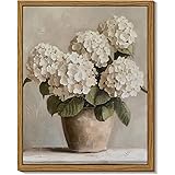
5. The Prevalence of Generic Art & Decor
One of the quickest routes to a cheap-looking home is the incorporation of generic art and decor. This includes mass-produced art prints, ubiquitous motivational quotes, or the endlessly repeated vase and Pampas grass combination seen across social media. While these items are not inherently “bad,” decorating a space primarily with such generic elements can render it impersonal, akin to a display unit. The impression conveyed is one of merely ticking boxes, rather than crafting a personalized sanctuary.
A more discerning approach dictates that every displayed item should possess beauty, functionality, or sentimental value. This could manifest as a unique handmade ceramic bowl, a framed family photograph, or even a quirky object that genuinely brings joy. Such pieces need not be expensive; even finds from affordable retailers can feel meaningful if selected with deliberation. A space is cheapened when its decor feels like an afterthought, a random purchase made out of boredom. When items are generic or devoid of meaning, the space itself reflects this emptiness. It appears uncurated, as if decorated out of obligation. It is often wiser to embrace blank spaces and patiently await the right pieces that resonate personally, rather than rushing into meaningless acquisitions. The most beautiful homes are not necessarily impeccably styled, but rather those that feel genuinely lived-in, layered, and authentic.
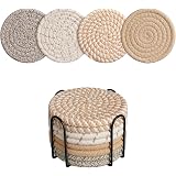
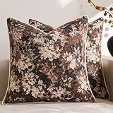
6. The Consequence of Lacking Texture
Another prevalent reason a home can appear cheap is a pervasive lack of texture, resulting in a visually dull, lifeless, and flat environment. When materials are predominantly smooth and synthetic—such as MDF, plastic, and polyester—they collectively contribute to a sterile sensation. The richness inherent in natural materials like wood, stone, linen, or woven fibers is noticeably absent. The significance of texture extends beyond mere aesthetics; research indicates that humans are instinctively drawn to texture, as it aids cognitive processing of the surrounding world.
Texture provides vital visual cues regarding surface roughness, depth, and material quality, making spaces feel more tactilely engaging and visually appealing. Consider the sensory experience of a forest, where barks, leaves, and stones each contribute to a rich, calming, and visually satisfying environment. In a domestic setting, extensive textural elements are not required. Simply incorporating a few varied textures—such as a wool rug, timber accents, linen fabrics, or even living plants—can introduce a small yet impactful contrast. This contrast adds depth, provides surfaces for light to interact with dynamically, and encourages the eye to explore the entire space, thus preventing a monotonous visual experience.
7. Overcoming Builder-Grade Syndrome
Many homes feature ubiquitous “builder-grade” finishes: the common “boob light” in hallways, flat mirrors above bathroom sinks, shiny silver cabinet knobs, or an abundance of ceiling pot lights. These are often default selections made by contractors to maximize profitability, not to imbue a home with distinctiveness. When such generic elements are pervasive, the entire space can feel bland and unremarkable, much like being presented with plain toast for every meal—functional, yet entirely uninspired. The remedy for builder-grade syndrome does not demand exorbitant spending. A significant transformation can be achieved through a few strategic upgrades.
Replacing a standard bathroom vanity mirror or light fixture with something more unique, or swapping a “boob light” for a statement flush mount or pendant, can dramatically alter a room’s character. For those undertaking a renovation, it is prudent to explore beyond the most obvious or readily available options. Numerous budget-friendly alternatives exist that offer superior aesthetic appeal. These seemingly minor modifications accumulate to create a home that feels significantly more personal and elevated, reflecting thoughtful consideration rather than default choices.
8. The Balance Between Matchy-Matchy and Disconnected Decor
Achieving equilibrium between an utterly disconnected space and one that is excessively “matchy-matchy” presents a common challenge in interior design. Overly coordinated decor can appear cheap because it results in a one-dimensional environment, suggesting quick, uninspired purchases rather than a thoughtfully curated collection. Conversely, a space where rooms feel entirely disjointed, filled with random objects and lacking any visual thread, appears chaotic and indicates an absence of deliberate design. The optimal outcome is a space that feels both cohesive and considered, yet simultaneously layered with personality and visual intrigue.
The fundamental principle for achieving this is to mix rather than precisely match. Successful execution necessitates an initial plan, encompassing personal preferences, functional requirements, and the desired emotional atmosphere of the space. It is advisable to anchor a room with a central piece, such as a bed, sofa, or a significant rug, and then build around it with complementary items. This involves introducing contrast: opting for varied pieces rather than identical ones, employing a layered color palette instead of a single accent color, and mixing patterns of different scales while uniting them through a shared hue. Furthermore, incorporating furniture and objects of diverse shapes or styles, linked by a common material, enhances this effect. This approach extends to inter-room connections as well, through consistent trim, repeated accent colors, or echoed materials, subtly connecting disparate spaces. This technique of establishing visual continuity without repetitiveness is vital for a truly elevated home aesthetic.
9. The Detrimental Impact of Clutter
Clutter stands as a silent antagonist to effective design, insidiously accumulating with each random trinket or misplaced item until a living space more closely resembles a garage sale than a home. While an immaculate environment is not always practical or desirable, a degree of care and organization is essential. A pervasive mess conveys a sense of capitulation regarding the space’s aesthetic potential. The antidote begins with establishing simple, practical organizational systems tailored to one’s lifestyle. This could entail designated trays for everyday essentials, decorative baskets to discreetly contain disarray, or even specific drawers for end-of-day tidying.
Life becomes considerably more manageable and the home’s appearance significantly improved when a system is in place for managing inevitable clutter. Another frequent pitfall is over-decorating, which involves surfaces laden with superfluous trinkets or sofas buried under so many cushions that sitting becomes an endeavor. More is not inherently better in design. The act of editing and thoughtfully curating belongings is where true magic often unfolds. By decluttering and intentionally selecting what remains, a home can transform from chaotic to serene, embracing the principle that less can indeed be more when striving for an elevated home aesthetic.
Beyond the Cheap Look: Your Questions Answered
What makes a home look ‘cheap’ even if I spent money on decor?
A home can look cheap due to a lack of intentional design, regardless of how much money was spent. This often comes from thoughtless choices, using poor quality imitation materials, or lacking visual depth and varied textures.
Does making my home look ‘expensive’ mean I need to spend a lot of money?
No, making your home look elevated is more about deliberate choices and smart styling than about the price tag of individual items. Focusing on intentional design principles can make a big difference on any budget.
Why is it important for curtains to be wide enough?
Curtains that are too narrow stretch tautly and lack elegant folds, making them look like a plain sheet instead of a luxurious treatment. To create a rich, opulent look, fabric panels should be 2 to 2.5 times the width of the window.
What is ‘generic art and decor’ and why should I avoid it?
Generic art and decor are mass-produced items like common prints or motivational quotes that lack personal meaning. Decorating with too many generic items makes a space feel impersonal and uncurated, rather than a unique sanctuary.
How can clutter negatively impact my home’s appearance?
Clutter makes a home look less appealing by creating a sense of disorganization and a lack of care. Too many random or misplaced items can make a space feel chaotic instead of serene and thoughtfully designed.