Unmasking Common Interior Design Mistakes: An Expert’s Eye on Your Home
Stepping into a new home, one often forms an immediate impression. For a seasoned interior design professional, however, that impression runs deeper. It’s an innate analysis, a subtle cataloging of the common interior design mistakes that might go unnoticed by many, yet leap out to an expert eye. Just as the accompanying video reveals, certain spatial missteps and aesthetic oversights can significantly diminish a home’s potential, often without the homeowner ever realizing it.
We’ve all been there, admiring a friend’s new sofa or a freshly painted wall. Yet, a true design savant perceives the underlying currents: the subtle imbalance, the missed opportunity for elevated style. This article expands on those precise observations, delving into the unseen interior design mistakes that professional designers instinctively pinpoint, offering insights to transform your living space from merely decorated to truly designed.
The Illumination Imperative: Why Bad Lighting is a Cardinal Sin of Interior Design
Imagine a symphony hall with only half the instruments playing. That is bad lighting in an interior. It is the immediate tell-tale sign of an undeveloped space. The video rightly highlights this as a primary offense.
Lighting is the atmospheric architect of any room. It sculpts mood, defines function, and dictates perception. The single-source, harsh overhead light, often found in older homes, is a common culprit. This flat illumination strips a room of its dimensionality, casting unflattering shadows and creating an unwelcoming ambiance.
Beyond the Bulb: Mastering Light Temperature and Layers
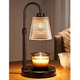
The “warmer bulb” recommendation from the video touches upon a critical concept: color temperature. Measured in Kelvin (K), this determines the hue of light emitted. High Kelvin numbers (e.g., 5000K+) produce cool, bluish light, ideal for task-oriented areas like kitchens or home offices where alertness is paramount. Conversely, lower Kelvin numbers (e.g., 2700K-3000K) yield warm, yellowish light, fostering comfort and relaxation—perfect for living rooms and bedrooms.
Effective lighting design, a cornerstone of successful spatial planning, employs layers. Ambient lighting provides overall illumination, task lighting focuses on specific activities (reading lamps, under-cabinet lights), and accent lighting highlights architectural features or artwork. Neglecting this layered approach, relying solely on overhead fixtures, is a fundamental interior design mistake. It leaves a room feeling cold, uninviting, and utterly devoid of character. A well-lit room feels intuitive; a poorly lit one, disorienting.
Furniture Faux Pas: Arranging for Flow and Function
Pulling a sofa away from a wall seems like a small act. Yet, its impact on spatial dynamics is monumental. This simple adjustment opens up a room, creating a sense of expansiveness and allowing for more intimate conversational groupings. The common interior design mistake of “wall-hugging” furniture stifles interaction and limits design possibilities. It’s like pushing all the pieces of a chessboard to the edge, rather than orchestrating a strategic play in the center.
Orchestrating Spatial Harmony: From Walkways to Conversational Zones
Furniture arrangement is the choreography of a room. It dictates traffic flow and defines functional zones. Many homes suffer from layouts centered solely around a television, neglecting human interaction. Instead, aim for conversational groupings. Place sofas and chairs facing each other, or at comfortable angles, to facilitate dialogue. Ensure clear, unobstructed pathways, often 36-48 inches wide, to prevent awkward navigation. An expert immediately identifies a room that feels tight or disjointed due to poor furniture placement.
Consider the room’s purpose. A living room needs areas for lounging, conversation, and perhaps reading. A bedroom requires a serene retreat. Each piece should serve a function and contribute to the overall balance. Failing to optimize these elements is a key interior design mistake that impacts both aesthetics and livability.
The Pitfall of Trends: Cultivating Authentic Style
The allure of the latest trend is potent. Social media feeds are awash with fleeting aesthetics. Yet, as the video observes, a home that screams “trendy” often lacks true personality. Blindly following a singular aesthetic, whether it’s “farmhouse chic” or “boho minimalist,” is a significant interior design mistake. It results in a generic space, devoid of the homeowner’s unique story.
Beyond the Hype: Crafting Your Signature Design Language
A truly designed home reflects its inhabitants. It’s a curated collection of pieces that resonate, not just a carbon copy of a Pinterest board. While inspiration is valuable, imitation stagnates. Developing a personal style involves asking deep questions: What colors speak to you? What textures evoke comfort? What objects carry sentimental weight? It’s a process of introspection and experimentation, often involving mixing elements from various design eras and cultural influences.
An expert can instantly discern when a home is a thoughtful reflection of its owner versus a museum of current fads. The former feels timeless and inviting; the latter, sterile and transient. This interior design mistake often stems from a fear of making “wrong” choices, leading individuals to rely on pre-packaged aesthetics rather than trusting their own instincts.
Designing for Two (or More): The Perils of Monopolized Decor
A home shared by multiple individuals should reflect all its occupants. The interior design mistake of one person’s aesthetic completely dominating a shared space is a common, yet often overlooked, pitfall. Whether it’s an explosion of “pink” as mentioned in the video, or a specific design theme imposed without consultation, it creates an environment that feels less like a shared sanctuary and more like a personal gallery.
Harmonizing Visions: Collaborative Home Design
Successful shared living spaces are the product of collaborative design. Even if one partner has a stronger interest in interiors, their role should be that of a facilitator, not a dictator. Small acts of inclusion—asking for opinions on two options, discussing furniture choices, or dedicating specific zones to individual preferences—can make a profound difference. The goal is to weave together individual tastes into a harmonious tapestry that celebrates everyone’s presence. A home should be a collective narrative, not a solo memoir. Ignoring the collective preferences results in an interior design mistake that impacts emotional comfort as much as visual appeal.
Wall-Hung Woes: Art, TVs, and Structural Integrity
How items are hung on walls speaks volumes about attention to detail. An expert’s eye quickly catches a television mounted too high or too low, art haphazardly placed, or shelves that visibly sag. These are not merely aesthetic issues; they often betray a lack of understanding of fundamental design principles and, at times, safety concerns.
Precision in Placement: Elevating Wall Decor
The “too high TV” is a classic interior design mistake. For optimal viewing comfort, the center of the screen should ideally be at eye level when seated. Art, similarly, should be hung so its center point is roughly 57-60 inches from the floor, mimicking average eye level. This creates a natural, comfortable viewing experience. A single, small piece of art on a vast wall often feels lost and inconsequential, rather than making a statement. Consider gallery walls or larger pieces that command attention and fill the space appropriately.
Beyond aesthetics, proper installation is paramount. The video mentions the lack of wall anchors for shelves. This isn’t just an interior design mistake; it’s a safety hazard. Ensuring shelves are level and securely fastened prevents tilting and potential collapse, protecting both your belongings and those in the home. Wall decor, when executed thoughtfully, elevates a room. When done poorly, it diminishes it.
Window Wonders: Transforming Treatments from Functional to Fabulous
Window treatments are more than just light blockers; they are crucial design elements that complete a room’s aesthetic. The video touches on “weird window treatments” and outdated blinds. This highlights a common oversight where functionality trumps form, resulting in a missed opportunity for visual enhancement.
Dressing Windows with Intention: Beyond Basic Blinds
Many inherit builder-grade blinds or simply opt for the cheapest solution, perpetuating an interior design mistake. Instead, consider curtains that extend from near the ceiling to just graze the floor. This creates an illusion of height, making windows appear taller and rooms more expansive. Track curtains, mentioned in the transcript, offer a sleek, modern alternative to traditional rods, allowing for smooth operation and a minimalist aesthetic. Affordable options, such as those found at IKEA, prove that stylish window treatments don’t require a hefty investment.
The fabric, color, and texture of window treatments play a significant role. Sheer curtains can soften light, while blackout drapes offer privacy and light control. The choice should align with the room’s function and overall design scheme. Leaving windows bare, or dressing them in ill-fitting or outdated treatments, is a subtle yet impactful interior design mistake that an expert will instantly clock.
Rug Ruckus: Sizing Up Your Floor Coverings
A rug can anchor a space, define a zone, and add warmth, texture, and color. Conversely, an incorrectly sized or placed rug can disrupt visual harmony, making a room feel disproportional or incomplete. “Rugs that are too small” is a classic interior design mistake frequently observed by professionals.
Grounding Your Space: The Art of Rug Placement and Sizing
In the living room, the general rule of thumb is that all major furniture pieces should have at least their front legs on the rug. Ideally, a large rug can accommodate all furniture entirely, unifying the seating arrangement. A postage stamp-sized rug floating in the middle of a seating area is a common design gaffe. It makes the room feel disjointed, as if the furniture is adrift.
For bedrooms, the rug should extend sufficiently beyond the sides of the bed, allowing you to step onto a soft surface upon waking. A common approach is for the rug to extend at least 18-24 inches beyond the sides and foot of a queen or king-sized bed, encompassing the nightstands. The video also mentions the importance of a rug pad, especially for thin kilim rugs. This not only prevents slipping, enhancing safety, but also adds cushioning and prolongs the rug’s life. While rugs in entryways or kitchens are optional, their presence in living rooms and bedrooms is deemed essential for grounding major furniture and defining these key areas. Neglecting proper rug usage is a significant interior design mistake that impacts both comfort and cohesion.
The Accumulation Conundrum: Too Much Furniture, Not Enough Space
As individuals settle into their first “real” places, often in their mid-twenties to thirties, the tendency to accumulate furniture is strong. Hand-me-downs, impulse buys, and sentimental attachments often lead to a home bursting at the seams. “Too much furniture” is a subtle yet pervasive interior design mistake that an expert can spot instantly.
The Art of Editing: Decluttering for Clarity and Comfort
A cluttered room feels chaotic and visually overwhelming. While sentimentality is understandable, design often requires a practical approach to possessions. Too many pieces of furniture, especially those that are ill-suited to the scale of the room, hinder movement and create visual noise. It’s like trying to fit an orchestra into a small jazz club—the sound becomes muddy, and the performers are cramped.
The solution lies in ruthless editing. This involves sifting through possessions, deciding what truly serves a purpose or brings joy, and letting go of the rest. Rather than relegating excess items to a storage unit indefinitely, consider donating, selling, or repurposing. A sparsely furnished room, by contrast, feels intentional and calming. It allows each piece to breathe and contribute meaningfully to the space. This isn’t about minimalism for its own sake, but about creating an environment where every element is chosen with purpose, avoiding the interior design mistake of an overstuffed aesthetic.
Functionality Fumbles: Overlooking Storage and Efficiency
A truly well-designed home marries aesthetics with practicality. When form trumps function entirely, ignoring the daily needs of its inhabitants, an expert designer will note the deficiency. A key interior design mistake is the failure to optimize for storage and functionality, especially in smaller spaces.
Strategic Solutions: Maximizing Space and Streamlining Life
Consider a small bedroom where the bed could be elevated to create under-bed storage, or a wall-mounted shelving unit could extend to the ceiling. These are not just clever tricks; they are essential design strategies that enhance livability. Multi-functional furniture, such as ottomans with hidden storage or convertible sofa beds, also plays a crucial role in compact living.
Good design anticipates needs. It considers how a space will be used, how items will be stored, and how everyday tasks can be made simpler. A home should be a well-oiled machine, supporting its occupants rather than adding friction. The absence of thoughtful storage solutions or efficient layouts signals a missed opportunity to transform a mere dwelling into a truly functional sanctuary. Addressing this common interior design mistake can dramatically improve daily comfort and overall satisfaction with a home.
Seeing What You Miss: Your Design Q&A
What is a common mistake people make with room lighting?
A common mistake is using only a single, harsh overhead light source, which makes a room feel flat and unwelcoming. Effective lighting uses layers, combining ambient, task, and accent lights to create mood and define function.
How should I arrange furniture in my living room for better flow?
Avoid pushing all furniture against the walls; pull pieces like sofas slightly away to open up the room. Arrange furniture to create comfortable conversational groupings and ensure clear, unobstructed pathways, often 36-48 inches wide.
Why is the size of my rug important for a room’s design?
A rug that is too small can make a room feel disjointed and disproportional. Ideally, in a living room, all major furniture pieces should have at least their front legs on the rug to properly anchor the space.
How high should I hang my TV or artwork on the wall?
For optimal viewing, the center of your TV screen should ideally be at eye level when seated. Artwork should generally be hung so its center point is roughly 57-60 inches from the floor, mimicking average eye level.