Ensuring your home reflects both style and comfort is a universal aspiration, yet many individuals inadvertently make common interior design mistakes that diminish the luxurious appeal of their living spaces. The accompanying video by Ekta Makadia, a renowned interior designer, effectively highlights ten prevalent errors homeowners often commit, providing foundational insights into transforming one’s residence. This comprehensive guide will further elaborate on these critical oversights, offering detailed strategies and actionable advice for rectifying them, thereby ensuring your home’s aesthetic and functional integrity remain uncompromised.
Prioritizing Style Over Functionality: The Foremost Interior Design Mistake
One of the most significant interior design mistakes is allowing aesthetic appeal to overshadow practical utility. While the desire for a home that mirrors magazine spreads is understandable, a dwelling fundamentally serves as a living space, not merely a static set for photography. Consequently, decisions that sacrifice everyday usability for superficial grandeur often lead to long-term dissatisfaction and inconvenience. For instance, selecting delicate white sofas in households with children or pets frequently results in discolored upholstery, underscoring a fundamental mismatch between design choice and lifestyle requirements.
Achieving Balance in Home Decor
A harmonious interior design is predicated upon a delicate equilibrium between style and functionality. Furniture and decor items should not only contribute to visual appeal but also accommodate the specific needs of the occupants. For example, a sofa ought to be both aesthetically pleasing and sufficiently comfortable for prolonged use, aligning seamlessly with the family’s activities. Similarly, a dining table must facilitate gatherings effectively while also featuring surfaces that are resilient and easy to clean, mitigating the stress of inevitable spills. Therefore, when evaluating elements from wall colors to furniture, careful consideration must be given to practicality, usability, maintenance, and overall style, ensuring the home remains a comfortable and sustainable environment.
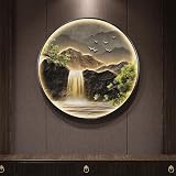
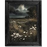
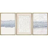
The Art of Precise Placement: Addressing Artwork and Wall Decor Missteps
Incorrect placement of artwork and wall decor is another common misstep that significantly impacts a room’s overall visual balance. Frequently, pieces are hung either too high or too low, off-center, or are disproportionate to the wall space, creating an unsettling visual dynamic. The precision required for effective artwork placement cannot be overstated, as it possesses the power to profoundly alter a space’s perceived look and feel. Adhering to specific guidelines is crucial for achieving an intentional and polished appearance within any interior design scheme.
Strategic Hanging for Optimal Impact
The ideal height for hanging artwork is typically at eye level, which implies the center of the piece should approximate an average person’s sightline when standing. While individual heights vary, aiming for a general average ensures accessibility and comfort for most viewers. When positioning frames or artwork above a sofa or bed, the piece’s width should ideally be two-thirds of the furniture’s width; for instance, an 84-inch sofa necessitates artwork between 56 and 63 inches wide. Furthermore, the bottom edge of the artwork should be positioned approximately 8 to 10 inches above the furniture to prevent head collision and maintain proper visual separation. For gallery walls featuring multiple frames, arranging them cohesively as a single group, with equal spacing between each piece, is imperative for an organized and impactful display. Should artwork be placed within wall moulding, central alignment, both horizontally and vertically, ensures an integrated look.
Mastering Pattern Play: Avoiding Overwhelmed Spaces
A frequent error observed in interior design mistakes involves overwhelming a space with an excessive or mismatched array of patterns. Juxtaposing disparate patterns—such as florals on wallpaper, stripes on curtains, geometric designs on rugs, and various prints on cushions—can result in a cluttered and visually chaotic environment. While patterns are essential for injecting visual interest and character into a room, their indiscriminate use can prevent the eye from focusing on any single element, leading to a sense of disarray. Therefore, a disciplined approach to pattern integration is fundamental for maintaining an elegant and cohesive aesthetic.
The 60-30-10 Rule for Pattern Balance
To effectively balance patterns, the golden rule of 60-30-10 is widely advocated: 60% of the room should feature solid colors, 30% should be dedicated to a dominant pattern, and 10% should incorporate a contrasting pattern. For example, if a floral wallpaper is chosen, lighter shades from its palette might be used for curtains, while darker tones can be incorporated into cushions, establishing a cohesive theme. Conversely, if patterned flooring is present, the rug, sofa, and walls should primarily feature solid colors, with art pieces or cushions offering opportunities for subtle pattern introduction. Intriguingly, patterns can also manipulate spatial perception: vertical stripes can visually elevate ceilings, while horizontal stripes can expand the perceived width of walls. Adhering to this balanced approach ensures that patterns enhance rather than detract from a space’s overall appeal.
Window Wisdom: Optimizing Treatments for Ambiance and Privacy
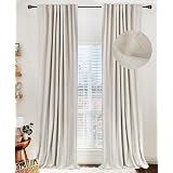
The neglect of windows, often viewed as mere openings, constitutes another significant interior design mistake. The choice of curtains, blinds, or shades is frequently underestimated, with many assuming any window covering will suffice. However, window treatments transcend simple light control; they are pivotal in defining a space’s overall ambiance and functionality. Untreated or inappropriately treated windows can lead to considerable issues, including a lack of privacy, inadequate light regulation, and discomfort from harsh sunlight, particularly for west-facing windows.
Strategic Selection of Window Dressings
Effective window treatment strategies involve a considered approach to material, color, and pattern, harmonizing these elements with the room’s theme and the window’s orientation. For windows exposed to intense sunlight, a combination of sheer and blackout curtains is highly recommended, offering both diffused light and complete darkness as needed. A pelmet can be used to discreetly conceal the curtain track, contributing to a polished and integrated look. The decision between Roman blinds, which offer a clean, tailored appearance, and grommet curtains, known for their soft folds, depends on the desired aesthetic and functional requirements. Understanding the nuances of each option ensures optimal light management, privacy, and aesthetic contribution to the interior design.
Curating Your Decor: The “Less Is More” Approach
The impulse to fill every available surface with decorative items is a prevalent interior design mistake that often leads to cluttered and overwhelming spaces. While decor is essential for infusing a home with style and character, an abundance of extraneous objects transforms a personal sanctuary into what can feel like an artifact showroom. The effectiveness of decorative elements is frequently diminished when they are amassed without purpose or thoughtful arrangement, hindering the ability of individual pieces to make a statement.
Thoughtful Selection and Arrangement
A simple yet impactful rule dictates that no more than three or four elements should adorn any single surface, such as a table or shelf. This approach encourages deliberate selection, prioritizing meaningful and relatable items over sheer quantity. Rather than showcasing every received gift or acquisition, one should curate a collection that reflects personal taste and complements the existing decor. By adopting a “less is more” philosophy, each decorative item is afforded the space to be appreciated, contributing to a sense of calm and sophistication within the home. This mindful curation prevents visual overload, allowing the eye to rest and appreciate the beauty of each chosen piece.
The Sofa’s Stature: Ensuring Proper Proportions
Selecting a sofa that is disproportionately large for the living space is another critical interior design mistake frequently observed. While a sofa serves as the central focal point and functional anchor of a living room, an incorrectly sized piece can disrupt the room’s balance, making even spacious areas feel cramped and uninviting. This common oversight not only impedes comfortable movement but also undermines the overall aesthetic coherence of the design.
Measuring for Perfect Fit and Flow
To avoid this pitfall, precise measurement of the room prior to purchasing a sofa is absolutely essential. A general guideline suggests that the sofa’s width should occupy approximately two-thirds of the room’s width, ensuring adequate clearance for movement and other furniture. Various configurations, such as 3-2-2, 3-3-2, 3-2-1, or 3-1-1 (referring to the number of seats), can be chosen based on room dimensions and seating requirements. It is highly recommended to mark the proposed sofa footprint on the floor with painter’s tape to physically assess movement paths and ensure comfortable circulation around the furniture. This proactive step helps in visualizing the impact of the sofa’s size within the actual space, preventing costly errors and ensuring a balanced layout.
Elevating Vertical Spaces: Unlocking Room Potential
Neglecting vertical space, often treating walls as mere backdrops rather than integral design opportunities, constitutes a significant interior design mistake. Blank walls can render a room feeling unfinished and smaller than its actual dimensions. Conversely, intelligent utilization of vertical areas—encompassing walls and ceiling spaces—is a hidden secret to creating a perception of greater expansiveness and completeness within an interior. This approach transforms overlooked surfaces into dynamic elements that enhance both functionality and visual appeal.
Innovative Strategies for Vertical Dimension
Several effective strategies can be employed to leverage vertical space. The creation of a gallery wall, featuring a curated arrangement of family photographs, diverse artworks, or strategically placed mirrors, adds personality and depth. Tall shelves or bookcases, extending towards the ceiling, offer not only storage for books but also display opportunities for decorative items, indoor plants, or stylish storage boxes. Furthermore, the installation of vertical striping or floor-to-ceiling curtains can visually heighten ceilings and enlarge windows, respectively. Mirrors, when strategically positioned, reflect light and create an illusion of increased space. Wall panelling, whether full-height or half-height, introduces architectural interest and texture, further contributing to the room’s character. By thoughtfully integrating these elements, walls are transformed from passive boundaries into active participants in the overall design narrative, enriching the sensory experience of the home.
Harmonizing Styles: Avoiding Design Clashes
The unintentional mixing of disparate interior styles represents another common interior design mistake. Combining elements like a modern sofa with a vintage coffee table, rustic shelves, and boho cushions within a single room can result in a discordant aesthetic, akin to a culinary fusion gone awry. While eclectic or transitional styles involve blending different themes, successful execution demands a keen understanding of compatibility to prevent visual disharmony.
Intentional Fusion and Style Compatibility
It is not always necessary for a space to adhere rigidly to a single theme; indeed, selective mixing of themes can elevate an interior when done judiciously. The key lies in ensuring that the chosen styles complement rather than clash. Certain pairings, such as industrial and farmhouse, or contemporary and mid-century modern, can create a rich, layered look when balanced appropriately. Conversely, attempting to blend overly contrasting styles without a unifying element often results in a chaotic and unrefined appearance. Designers often recommend adhering to specific ratios or identifying a dominant style while introducing subtle accents from another. This approach ensures that any stylistic fusion appears intentional and harmonious, contributing to a sophisticated and unique character within the home.
The Psychology of Color: Achieving Seamless Coordination
Implementing colors without a coherent strategy or connectivity throughout the home is a significant interior design mistake that can undermine the perceived quality of an interior. While luxurious homes sometimes employ monochromatic schemes, using various shades of a single hue for a refined look, random color choices typically lead to a disconnected and visually unsettling environment. The absence of a thoughtful color palette disrupts the flow between spaces, preventing the home from feeling unified and harmonious.
Leveraging the Color Wheel for Cohesion
Effective color coordination necessitates the application of color theory, primarily through the use of a color wheel. This fundamental tool guides the selection of colors that complement or contrast each other in visually pleasing ways. Understanding concepts such as analogous (colors next to each other on the wheel), complementary (colors opposite each other), and monochromatic schemes allows for deliberate and impactful color choices. For instance, selecting a base color and then utilizing its various tints, tones, and shades can create depth and sophistication. Alternatively, incorporating an accent color from the opposite side of the wheel can introduce vibrancy without overwhelming the space. Thoughtful application of color principles ensures that each room, and the home as a whole, possesses a cohesive and inviting atmosphere.
The Richness of Texture: Adding Depth and Interest
The final, yet equally impactful, interior design mistake involves neglecting the incorporation of varied textures within a space. An environment characterized by uniform textures can appear flat, uninteresting, and lack visual depth, thereby diminishing its overall appeal. The interplay of different textures is paramount for creating a dynamic and engaging sensory experience, inviting both sight and touch.
Cultivating a Multi-Sensory Environment
To infuse a home with visual and tactile interest, it is crucial to include a diverse range of textures, encompassing soft, hard, and natural elements. For example, the luxurious softness of a faux fur rug can be artfully contrasted with the sleek, reflective surface of a glass coffee table, complemented by the organic warmth of a wooden vase. This deliberate layering of materials—such as plush fabrics, rough natural stone, smooth metals, intricate weaves, and polished wood—adds complexity and sophistication without introducing additional clutter. Each texture contributes a unique quality, collectively transforming a space into a rich canvas that stimulates the senses and provides a more inviting, visually interesting, and welcoming atmosphere for both residents and guests.
Solving Your Design Dilemmas: Q&A
What is a common mistake beginners make in interior design?
A frequent mistake is focusing too much on how things look rather than how useful and comfortable they are for daily living, which can lead to dissatisfaction.
How high should I hang artwork on my walls?
Artwork should generally be hung at eye level, meaning the center of the piece should be around 56 to 63 inches from the floor for most viewers.
How can I use patterns in my home without making it look too busy?
To balance patterns, follow the 60-30-10 rule: 60% solid colors, 30% a dominant pattern, and 10% a contrasting pattern.
How many decorative items should I put on a surface like a table or shelf?
It’s best to follow a ‘less is more’ approach, placing no more than three or four carefully chosen items on a single surface to avoid clutter.
Why is it important to use different textures in home decor?
Incorporating varied textures, like soft fabrics or sleek metals, adds visual depth and interest to a room, making it feel more inviting and dynamic.