Transforming a living space into a truly inviting and visually appealing home doesn’t always require an exorbitant budget. In fact, as the accompanying video wisely points out, a home can still look inexpensive even with costly furniture if the underlying design choices aren’t cohesive. The real secret to elevating your home’s aesthetic and avoiding common design mistakes that cheapen a home lies not in the price tags, but in the intentionality and synergy of your selections.
Many homeowners find themselves frustrated, investing in pieces they love individually, only to discover their rooms lack a certain polish or ‘wow’ factor. This feeling often stems from a series of subtle missteps that, when combined, quietly downgrade the perceived quality of a space. This article expands on the insights shared in the video, providing practical guidance and deeper dives into how to create a home that feels curated, intentional, and undeniably stylish.
Elevating Your Home’s Aesthetic: Unpacking Common Design Mistakes
The Illusion of “Vertical Compression”: Designing Beyond Eye Level
One of the most pervasive design mistakes often made is the tendency to design in just one dimension. Homeowners frequently concentrate their efforts on the lower and middle sections of a room, furnishing floor space with sofas, coffee tables, and beds. This leaves a significant portion of the room – the upper half – feeling empty and visually neglected, making the entire space appear compressed and unbalanced.
However, an intentional room considers three distinct layers: lower, middle, and upper. While the lower and middle layers are often well-addressed, the upper layer demands equal attention. Elements like tall floor lamps, strategically hung artwork, substantial bookcases, wall sconces, or even pendant lights and chandeliers can draw the eye upward. Even tall plants or branches in a large vase can contribute to this vertical balance, ensuring a more complete and expansive feel.
To avoid this visual trap, aim to include at least one or two elements in each room that extend into that crucial upper third. This practice ensures your eye moves comfortably around the room, rather than getting stuck at ground level. For those struggling to visualize these changes, tools like Room Visualizer AI can offer a practical solution, allowing you to preview different layouts and furnishings before making a commitment.
Beyond the “Showroom in a Box”: Cultivating Curated Spaces
While flat-pack furniture offers undeniable convenience and affordability, relying too heavily on it can inadvertently cheapen a home’s appearance. The issue isn’t just about using “matchy-matchy” sets – a common faux pas many are already aware of. Instead, the challenge lies in the uniform aesthetics of many mass-produced pieces, often crafted from similar materials like MDF or particle board with simple shapes and printed finishes.
Individually, a flat-pack item might be perfectly acceptable, but a room overwhelmingly filled with them can feel flat and devoid of character. To counteract this, the key is contrast. Actively source furniture and decor from a variety of places, mixing different eras, materials, and silhouettes. Incorporate pieces with a bit more visual weight or unique detailing, such as a vintage solid wood side table, a sculptural lamp, or simply upgrading basic hardware to something more substantial like brass or ceramic knobs.
Paying attention to craftsmanship, grain, and the tactile quality of items signals effort and, in turn, value. Thrifting for solid wood pieces, refinishing them, or hunting online marketplaces like Facebook Marketplace or Craigslist for items with character can yield unique finds that break the “showroom effect.” A few well-chosen, contrasting pieces can transform a generic space into one that feels deeply personal and intentional, proving that unique and well-made items are attainable on any budget, though they may require more time and effort to discover.
Intentional Decor: Moving Past Generic and Artificial Accents
Generic decor and obviously artificial accents are another subtle culprit in making a home feel less sophisticated. Items like ubiquitous black and white city prints, generic word art, or mass-produced canvas prints often found in rental units lack personality. If a piece of decor could belong to literally anyone, it struggles to make a space feel special or reflective of its inhabitants.
A helpful guideline is the “beauty, function, or meaning” test for any item you consider displaying. Does it bring visual joy? Does it serve a practical purpose? Or does it hold personal significance? If an item fails all three criteria, it might be clutter rather than decor. For art, prioritize pieces that resonate with you personally—whether it’s a local artist’s work, a cherished personal photograph, a well-framed public domain print, or even a beloved album cover. These choices infuse a space with genuine character, making it far more interesting and personal.
Similarly, while plants undeniably enhance a space with life and color, the quality of faux plants matters immensely. While not everyone can maintain live plants, opting for those that look undeniably fake can detract from the entire room’s aesthetic. High-quality, natural-looking artificial plants that don’t give themselves away from a distance are readily available and can offer the desired greenery without the upkeep, proving that conscious choices elevate even the smallest details.
The Nuance of Color: Mastering a Richer Palette
A common misconception is that a room looks cheap due to a lack of color. More often, the issue stems from a lack of variation within the chosen colors. Many rooms fall into the “single pop cushion strategy,” where the same exact shade of an accent color is repeated uniformly across cushions, throws, and artwork. This creates a flat, one-dimensional feel, rather than the rich, layered aesthetic found in truly beautiful homes.
Instead of focusing on two or three distinct colors, consider the concept of a color family. The most visually engaging rooms often incorporate closer to twelve different tones within their palette, not twelve entirely different hues, but subtle variations of the same core colors. For example, if deep green is your accent, introduce forest green, sage, olive, and emerald across various objects and materials. These subtle shifts in shade create depth and visual interest while maintaining overall cohesion.
Furthermore, vary the materials through which these colors are expressed: velvet, linen, paint, ceramics, or different artwork styles. Each material naturally renders a color slightly differently, adding another layer of texture and variation. This is why selecting individual cushions rather than matching sets is often recommended, as it allows for an intentionally curated, more personal, and ultimately more expensive-looking outcome. Even in neutral rooms, a thoughtful blend of cream, oat, sand, and camel, across varied textures, prevents the space from appearing bland and instead lends it a rich, sophisticated feel.
Framing Your Views: The Art of Thoughtful Window Furnishings
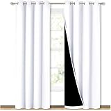
Windows are significant architectural features, and their treatment profoundly impacts a room’s overall aesthetic. Poorly chosen or installed window furnishings can negate the positive effects of otherwise beautiful furniture, making the entire space feel off. There are four recurring missteps to avoid: thin, flimsy curtains that lack fullness; panels that are too narrow or too short, barely covering the window; plastic-y vertical blinds or shades that appear temporary; and mounting curtains directly above the window frame, which visually compresses the room.
Conversely, well-considered window treatments can dramatically elevate a space. The general rule is to hang curtains high and wide. Ideally, curtain rods should be mounted closer to the ceiling than the top of the window frame, often about two-thirds of the way between the window and the ceiling. This draws the eye upward, making the room feel taller and more expansive. Additionally, extend the rod past the window frame on either side, allowing the curtains to frame the window generously when open, maximizing light and views.
For fullness, aim for curtain panels that are 1.5 to 2 times the width of your window. This ensures a luxurious drape and soft folds when closed, avoiding the stretched, flat appearance of insufficient fabric. As for length, curtains should either hover just off the floor, gently kiss the floor, or slightly puddle on the floor, each conveying a different aesthetic. Avoid anything awkwardly floating or unintentionally pulling. While custom curtains offer unparalleled tailoring, budget-friendly solutions include buying extra ready-made panels for added fullness, using clip rings for height adjustment, and hem tape for precise length modifications, ensuring your windows always look polished and intentional.
The Truth About Materials: Embracing Honesty and Texture
Another element that can instantly cheapen a home is the use of poor faux finishes. This includes fake marble that appears digitally printed or vinyl flooring with exaggerated, unnatural grain patterns. The core issue isn’t the material’s authenticity itself, but rather its attempt to mimic something it’s not, and doing so poorly. Real materials possess inherent variations, depth, and subtle imperfections that our brains are incredibly adept at recognizing, making overtly uniform or flat faux finishes stand out for the wrong reasons.
When selecting laminate or porcelain, choose patterns that are more restrained and less trying. Subtle designs are far easier to imitate convincingly and won’t become an unintentional focal point. For timber-look pieces, wood veneer or engineered wood flooring offer excellent alternatives to solid planks, providing genuine texture and grain at a more accessible price point. Wood veneer uses a real wood layer on the surface, while engineered wood flooring features a real hardwood top layer bonded over a stable core, delivering the authentic look and feel of timber without the full cost.
Beyond material honesty, varying textures is paramount for a rich and layered interior. Incorporate materials with tactile qualities such as linen, wool, ceramics, natural stone, and wood with visible grain. If a refined or formal ambiance is desired, smoother textures like marble, velvet, or glass can achieve this. Conversely, for a casual and inviting atmosphere, rougher textures like rattan, raw timber, clay, or textured fabrics like bouclé can make a space feel warmer and more relaxed. Even adding a single genuine material, such as a stone tray, a ceramic lamp, or a real plant, can introduce much-needed tactility and elevate the room’s perceived quality.
Beyond Default: Upgrading Builder-Grade Elements
Many homes come equipped with “builder-grade” defaults: recessed ceiling lights, standard “boob lights,” basic bathroom mirrors, and generic matte black knobs and handles. These selections, made for cost efficiency and construction simplification, often result in a home that feels generic and lacking personal touch. Moving beyond these defaults is a simple yet powerful way to infuse personality and elevate your home’s design.
Lighting is an excellent place to start. Relying solely on overhead ceiling lights creates flat, unflattering illumination. Instead, layered lighting is essential for ambiance and depth. Aim for three to five different light sources in each room, incorporating floor lamps, table lamps, wall sconces, and pendants. This allows for varied light levels and moods, ensuring you can comfortably navigate the room without harsh overhead illumination. Swapping out a builder-grade “boob light” for a well-proportioned semi-flush mount is a quick and impactful upgrade.
Hardware is another easy win. Replacing basic knobs and pulls on cabinetry with something more substantial and stylish can instantly transform the feel of your kitchen or bathroom. These small details are seen and touched daily, making their impact significant. When renovating or building, explore options beyond standard contractor ranges for hardware and lighting. Finally, never underestimate the power of a fresh coat of paint. A thoughtfully chosen wall color, sampled properly within your specific room and lighting conditions, can completely shift the atmosphere and make a generic space feel intentionally yours.
The “Red Thread” Principle: Weaving Cohesion Throughout Your Home
A home can appear cheap not just from poor individual choices, but from a complete lack of connection between design elements. A space with unrelated colors, mismatched metals, and clashing wood tones from room to room feels disjointed and random. The concept of a “red thread” is crucial here: it doesn’t mean everything must match perfectly, but rather that certain elements should repeat, creating a sense of rhythm and intentionality.
As a simple guideline, try to repeat a key element at least twice within a room. If a walnut coffee table is introduced, echo that walnut tone in a picture frame, a decorative tray, or another piece of furniture. If brass is used in a lamp, repeat it in cabinet hardware or a mirror frame. If a rug features warm rust tones, pick up that color in a throw pillow or a piece of artwork. While mixing metals or wood tones is absolutely permissible, ensure that each choice “has a friend,” creating subtle connections that your brain registers as thoughtful design.
This principle extends across the entire home. While each room can certainly have its own distinct personality – perhaps one is bolder, another more serene – a subtle thread should connect them. This could be a consistent wood tone used in flooring or accent furniture, a deeper or lighter version of a primary color family, a shared architectural language, or a consistent underlying design style. This cohesion prevents the home from feeling pieced together and instead makes it feel welcoming, considered, and inherently more valuable.
The Strategic Accent Wall: When and How to Use It Effectively
Accent walls, when executed incorrectly, can paradoxically make a room look cheaper rather than more interesting. Two common pitfalls are the “lonely wall” and the “half-committed feature.” A lonely wall is a bold color or paneling applied to a single wall without any architectural feature (like a fireplace) or significant decor to anchor it. This draws attention to a meaningless wall, creating an awkward focal point.
The “half-committed feature” involves paneling or slats that only cover part of a wall, neither framing anything properly nor extending fully to the edges. This often reads as hesitation, making the room feel unbalanced and unfinished. An accent wall can indeed work, but like all good design decisions, it must be intentional and well-executed. If a bold color or wallpaper is truly loved, consider applying it to the entire room for a more enveloping and sophisticated look rather than isolating it.
If an accent wall is desired, ensure it can support a strong focal point, such as a bed head wall, or a wall showcasing a console table with a large mirror or artwork. If adding paneling or slats, ensure they fit the home’s architectural style and extend fully from edge to edge, integrating seamlessly into the room rather than appearing as an afterthought. Often, a room feels flat not because it needs an accent wall, but because fundamental design principles – like vertical decorating, varied textures, curated furnishings, and cohesive color palettes – have been overlooked. Mastering these foundational elements will create a visually rich space that doesn’t need an accent wall to compensate for other design mistakes that cheapen a home.
Q&A: From Cheap Mistakes to Chic Spaces
How can I make my home look more expensive without spending a lot of money?
Focus on intentional design choices and cohesive styling, rather than just buying costly furniture. Avoiding common mistakes can significantly elevate your space’s perceived quality.
What does it mean to design ‘beyond eye level’ in a room?
Designing ‘beyond eye level’ means paying attention to the upper parts of your room, not just the lower furniture. Incorporate tall elements like artwork, floor lamps, or pendant lights to make the space feel balanced and expansive.
Should I avoid buying all my furniture from the same store or in matching sets?
Yes, relying too much on matching furniture sets or mass-produced items can make a room feel flat and generic. Mix pieces from various sources, materials, and styles to create a more unique and curated look.
What’s the best way to hang curtains to improve a room’s appearance?
Hang curtains high and wide; mount the rod closer to the ceiling and extend it past the window frame to make the room feel taller. Ensure curtains are full and long enough to just touch or gently puddle on the floor for a polished look.