In the accompanying video, a comprehensive guide to avoiding common living room design mistakes is presented, illuminating why your space might not feel quite right despite your best efforts. Decorating a living room often involves significant investment in time, money, and emotional energy. Unfortunately, even with good intentions, subtle design missteps can prevent a room from achieving its full potential. This article builds upon those insights, delving deeper into the psychological and practical implications of each error and offering refined strategies to cultivate a truly inviting and functional living environment.
Addressing Ill-Considered Furniture Scaling
One of the most pervasive living room design mistakes involves misjudging furniture scale. Imagine if you bought a luxury car for a tiny garage; the mismatch is instantly apparent. When a sofa dominates a small room or a minuscule coffee table gets lost in a grand space, the visual disharmony is palpable. It often stems from an impulse purchase, where a piece looks fantastic in a vast showroom but overwhelms or underwhelms its intended home.
The key lies in understanding spatial requirements. Your sofa, for instance, requires adequate “breathing room,” ideally leaving at least 18 inches (approximately 45 centimeters) of wall space on each side. This margin prevents a cramped, suffocating feel. For more compact living rooms, furniture with slimmer profiles and visible legs can trick the eye, imparting a sense of greater openness. Conversely, in expansive areas, bulkier, grounded pieces provide necessary anchors, preventing the room from feeling stark or under-furnished. Furthermore, if an existing piece is slightly undersized, strategic pairing with a floor lamp, armchairs, or a plant can create a cohesive ensemble.
Achieving Perfect Proportion with the Two-Thirds Rule
Beyond individual furniture scale, an imbalance between pieces can significantly detract from a room’s aesthetic. The “two-thirds rule,” a principle rooted in the golden ratio – a universally pleasing proportion found in nature and classical architecture – offers a powerful guideline. When you adhere to this rule, your living room design mistakes related to proportion vanish. For example, your sofa should ideally occupy about two-thirds the width of the wall it sits against. This creates a natural focal point without feeling either too small or too expansive for its backdrop.
Extending this principle, your coffee table should generally be two-thirds the width of your sofa, and your television about two-thirds the width of its accompanying unit. This ensures a harmonious visual hierarchy. While a strict two-thirds adherence is an excellent starting point, a range between half to three-quarters can also yield successful outcomes, offering flexibility. Moreover, a fundamental rule dictates that the base should always be wider than what rests upon it. Your TV stand, therefore, must always surpass the TV’s width to avoid an awkward, top-heavy appearance. Similarly, a rug should extend at least 15 centimeters beyond your sofa on each side, serving to properly ground the seating area rather than appearing to float aimlessly.
Optimal TV Placement for Comfort and Aesthetics
One of the most common yet often overlooked living room design mistakes is mounting the TV too high. This error forces uncomfortable neck craning, reminiscent of sitting in the very front row of a cinema. A high-mounted TV also disrupts the room’s visual equilibrium, drawing the eye upwards awkwardly and creating an unbalanced feel, particularly evident when positioned above a fireplace. The ideal placement for comfort and visual harmony dictates that the center of your television screen should be at eye level when you are seated, typically falling between 42 to 48 inches (approximately 107 to 122 centimeters) from the floor to the screen’s middle.
If mounting above a fireplace is unavoidable due to spatial constraints, consider innovative solutions like a mantel mount. This mechanism allows the screen to be lowered for viewing and retracted when not in use. Alternatively, explore mounting the TV on an adjacent wall, perpendicular to the fireplace, or even to the side at a more comfortable height. Furthermore, technology like a Frame TV, designed to mimic artwork, offers greater flexibility for slightly higher placement, blending seamlessly into a gallery wall arrangement without compromising the room’s balance.
Cultivating Vertical Variety: The “City Skyline” Effect
A living room can easily fall flat if all its elements exist on a single horizontal plane, a frequent type of living room design mistake. Imagine a city skyline where every building is the same height; it lacks visual interest and dynamic tension. Similarly, a living room dominated by only low-slung furniture and squat accessories feels bottom-heavy and uninspired. The solution is to introduce vertical variety, drawing the eye upward and adding essential dimension.
This “city skyline” approach involves layering elements from different height categories. Foundational pieces include sofas, rugs, and large furniture. Mid-level elements encompass coffee tables, armchairs, and side tables. Finally, vertical players like floor lamps, tall plants, wall sconces, bookshelves, oversized art, and curtains extended well above the window frame elevate the space. Curtains, when hung high (about two-thirds the way between the window frame and the ceiling), create an illusion of taller windows and higher ceilings, providing a subtle but impactful “facelift” for the room. By strategically incorporating items from each layer, a rich, dynamic, and visually engaging living room emerges.
Distributing Visual Weight for Balanced Aesthetics
Following on from vertical variety, an imbalanced distribution of visual weight is another common living room design mistake. This isn’t about physical heft, but rather how visually “heavy” a piece appears. A chunky, grounded sofa, for instance, carries more visual weight than a similarly sized sofa on slender legs. When all the visually heavy items are clustered on one side, the room feels lopsided, creating an unsettling sense of imbalance.
To rectify this, assess your room’s visual equilibrium. If a bulky sofa anchors one side, seek to balance it with an item of comparable visual gravitas on the opposing side – perhaps a substantial armchair and a large floor lamp. Alternatively, if the entire room feels oppressively heavy, introduce lighter pieces. Elements crafted from glass, metal, or those featuring sleek, elevated legs can inject a much-needed sense of airiness, preventing the space from feeling stifling. This strategic interplay of visual weight ensures every element contributes to an overall feeling of stability and harmony.
Injecting Dynamic Shapes: Breaking the Grid
Modern living room design mistakes often involve an over-reliance on straight lines and angular forms. Boxy sofas, rectangular coffee tables, square rugs, and linear layouts can make a room feel stiff, rigid, and akin to a sterile grid. The absence of contrasting shapes deprives the space of softness and invitation. To counteract this, integrating curves and organic forms is essential, introducing a crucial counterpoint to the prevailing linearity.
Consider swapping a rectangular coffee table for a round or oval alternative, or introducing a curved armchair to soften sharp edges. Arch mirrors, sculptural vases, and lighting fixtures with fluid lines are excellent choices for infusing organic elements. These curved forms break up the visual monotony, guiding the eye gently through the space and creating a more welcoming, dynamic environment. The interplay of geometric precision with natural curves contributes significantly to a sophisticated and inviting aesthetic.
Optimizing Furniture Layout: Beyond the Walls
A common misconception, particularly in larger living rooms, is that pushing all furniture against the walls maximizes space. This fundamental living room design mistake paradoxically creates an awkward, empty void in the center, resembling a waiting room rather than an intimate gathering space. It forces guests to shout across the room for conversation, undermining the very purpose of a living area.
The solution involves bringing furniture inward to define conversation zones. Start by centering the sofa, then arrange armchairs and other seating around it, fostering a comfortable and cohesive interaction area. In expansive rooms, the space surrounding this primary arrangement can be utilized for secondary functions, such as a cozy reading nook, a well-placed console table, or a vibrant plant corner. Additionally, meticulous planning of walkways is paramount. Ensure at least 36 inches (approx. 90 cm) of clear passage, preventing inhabitants from having to “shimmy” past furniture or obstruct doors. Maintaining open flow contributes both to comfort and the room’s overall functionality.
Defining Zones in Open-Plan Living Spaces
Open-plan living spaces, while desirable for their expansive feel, present a unique set of living room design mistakes. Without inherent architectural boundaries, these areas can feel amorphous and undefined. The lack of visual cues can leave inhabitants feeling adrift, without a clear sense of purpose for each section of the large space.
The most effective strategy is to create distinct zones through strategic elements. Large area rugs are invaluable; positioning one under the seating area immediately demarcates a dedicated living zone. Furniture placement also acts as a powerful spatial divider; the back of a sofa, a console table, or a low bookshelf can effectively partition an open area without blocking light or flow. Sectional sofas are particularly adept at carving out natural seating areas in vast spaces. Furthermore, open shelving units provide visual separation while maintaining an airy feel. Thoughtful lighting, such as a pendant light over a specific table or a floor lamp beside a sofa, can further reinforce these defined zones, enhancing both functionality and aesthetic coherence.
Curating a Collected Aesthetic: Avoiding the Showroom Syndrome
Another prevalent living room design mistake is furnishing an entire space from a single store or collection. While convenient, this approach often results in a sterile, showroom-like appearance that lacks personality and authenticity. A truly inviting living room feels collected over time, reflecting the unique tastes and journey of its inhabitants, rather than a hastily assembled display.
To cultivate a collected aesthetic, embrace the art of mixing. Pair a contemporary sofa with a vintage coffee table, blend different wood tones, or introduce an unexpected accent chair. The goal is to create visual interest through juxtaposition. If you’re concerned about chaos, establish a few unifying threads, such as a cohesive color palette or repeating material textures, to ensure underlying harmony. This thoughtful curation results in a space that tells a story, making it profoundly more personal and engaging than a pre-packaged display.
The Power of Texture and Material Mixing
Many modern living room design mistakes stem from an over-reliance on smooth, uniform surfaces, often due to the prevalence of fast furniture made from MDF with similar coatings. A room devoid of diverse textures and materials feels one-dimensional, lacking depth, contrast, and tactile richness. It fails to engage the senses, resulting in an unexciting and uninviting atmosphere.
The remedy is to consciously mix textures and materials. Aim for a juxtaposition of matte with glossy, soft with hard, and rough with smooth. Imagine a chunky knit throw draped over a sleek leather sofa, a woven jute rug grounding a glass coffee table, or a rustic wood console complemented by a polished ceramic lamp. Expert designers often suggest aiming for a mix of five distinct materials within a single space, ensuring they work harmoniously. This layering of textures creates visual interest and tactile appeal, making the room feel more nuanced, sophisticated, and genuinely lived-in.
Strategic Accent Color Application: Beyond Matchy-Matchy
Introducing a “pop of color” is a popular concept, but it often leads to a common living room design mistake: the matchy-matchy trap. Buying multiple identical throw pillows in the exact same shade, for instance, makes the accent color feel forced and flat, rather than vibrant and intentional. When everything else is neutral, a singular, unvaried color demands attention in an almost aggressive way.
For a truly successful accent color strategy, embrace variation and repetition. If green is your chosen accent, incorporate various shades of green and different textures—think a deep emerald velvet cushion, a muted sage ceramic vase, and a patterned throw featuring lighter green tones. Spread these varied touches across the room, ensuring at least three distinct instances of the color in different forms. Remember, never buy more than two identical cushions of the same color. By repeating the color with varied shades or textures, you create a layered, intentional color story that enhances the room’s depth and visual appeal.
Intentional Accessorizing: Quality Over Quantity
The allure of small, charming decor items can lead to a significant living room design mistake: visual clutter. While individually appealing, an abundance of tiny trinkets overwhelms surfaces, creating a messy, disjointed impression. Small accessories often lack the gravitas to make a substantial impact on their own, prompting an over-accumulation that ultimately detracts from the room’s overall aesthetic.
Adopting a “less is more” philosophy is crucial. Instead of filling every surface with diminutive objects, opt for fewer, larger statement pieces. Consider accessories as “seasoning” for a dish: a pinch enhances, but too much ruins. A single, beautifully crafted vase, an oversized art piece, or a substantial decorative bowl will command attention and contribute more impactful visual weight than a dozen small curios. This approach encourages intentional curation, ensuring each accessory serves a purpose and elevates the space rather than merely occupying it.
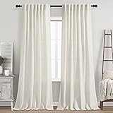
Elevating Your Space with Correct Curtain Placement
One of the easiest living room design mistakes to rectify, yet frequently overlooked, is improper curtain installation. Hanging curtain rods too low or using panels that are too short instantly makes ceilings appear lower and windows smaller, effectively “short-changing” the room’s perceived height and spaciousness. This common misstep can significantly detract from an otherwise well-designed space, creating a cramped and confined atmosphere.
To maximize vertical presence, mount curtain rods significantly higher than the window frame, ideally halfway to two-thirds of the way between the top of the window and the ceiling. This strategic placement “tricks” the eye into perceiving taller windows and higher ceilings. Furthermore, curtain panels must be adequately wide. A rule of thumb is that curtains should be at least two times the width of your window to achieve a luxurious, gathered look when closed. For a 2-meter wide window, for instance, you’d need at least 4 meters of fabric (or two 2-meter wide panels). Ample fabric ensures a full, rich appearance, preventing a stretched, sparse look and contributing to a sense of opulence.
Mastering Layered Lighting for Ambiance
Relying solely on a single overhead ceiling light is a ubiquitous living room design mistake. This “big light” trend, often critiqued in design circles, produces harsh shadows, washes out textures, and leaves corners feeling forgotten and uninviting. A singular light source creates a flat, unwelcoming atmosphere, failing to establish depth or mood.
The solution lies in layered lighting, which involves a strategic mix of ambient, task, and accent lighting. Ambient lighting, such as a chandelier, pendant, or recessed lights, provides overall illumination. Task lighting, like a reading lamp next to a sofa or a table lamp on a side table, offers functional illumination for specific activities. Accent lighting, through wall sconces, picture lights, or LED strips behind shelving, highlights architectural details, artwork, or focal points, adding drama and depth. This thoughtful layering creates a dynamic lighting scheme, allowing you to adjust the mood and functionality of your living room at will, transforming it from basic to beautifully atmospheric.
Choosing the Right Light Color Temperature
Beyond layering, using the wrong light color temperature is another critical living room design mistake that significantly impacts a room’s feel. An incorrect color temperature can render a space sterile and clinical, akin to a hospital waiting room, rather than warm and inviting. Moreover, mixing different color temperatures within the same room creates visual discord, causing lamps to clash rather than harmonize.
For living rooms, the “sweet spot” for color temperature typically falls up to 4000 Kelvin. Lower Kelvin values (e.g., 2700-3000K) produce a warm, golden glow, ideal for cozy evening relaxation. Around 3000K, you achieve a soft white that retains warmth but offers greater clarity. Anything above 4000K veers into cool, bluish territory, better suited for task-oriented spaces like offices. To maintain visual cohesion, it is imperative to use bulbs of the same color temperature across all fixtures in a room, and ideally, from the same brand to minimize discrepancies. This attention to detail ensures a consistent and inviting ambiance.
The Crucial Step: Measure Before You Procure
Attempting to furnish a living room without accurate measurements is perhaps the most fundamental and preventable living room design mistake. It is akin to buying shoes without knowing your size; while you might get lucky, the odds are stacked against a perfect fit. This oversight inevitably leads to ill-fitting furniture, awkward layouts, and wasted investment, creating spatial dilemmas that are difficult to undo.
Before any shopping commences, equip yourself with a tape measure and meticulously record the dimensions of your living room, including walls, windows, doorways, and existing furniture. When considering a new piece, compare its dimensions not just to the empty space but to how it will interact with other elements. Advanced planning tools like Magicplan, Floorplanner, or RoomSketcher allow you to virtually arrange furniture, providing a clear visual of how a sectional or a new coffee table will fit. Alternatively, a low-tech but highly effective method involves using masking tape to outline furniture dimensions directly on the floor, offering a tangible sense of scale within your actual space. This diligent preparation prevents costly errors and ensures every piece finds its perfect home.
Strategic Storage and Clutter Management
Even the most exquisitely designed living room succumbs to the visual chaos of clutter, a pervasive living room design mistake. Many individuals fail to incorporate sufficient storage solutions, leading to an inevitable accumulation of belongings that detracts from the room’s beauty and serenity. The psychological impact of clutter can be profound, creating a sense of overwhelm and unrest.
A guiding principle like Luwe’s 2-to-8 rule, which suggests 80% of belongings reside in closed storage and only 20% on display, offers a pragmatic framework. While adherence may vary based on household dynamics (e.g., families with children), the core takeaway remains: every item needs a designated place. Long, low modular units, such as an IKEA Besta setup, offer extensive closed storage while doubling as benches or display surfaces. In smaller living rooms, vertical storage solutions—tall bookshelves, mounted cabinets, or floating shelves—capitalize on unused wall space and visually elevate the ceiling. Don’t overlook underutilized areas; roll-out bins beneath sofas or storage ottomans provide discreet, functional storage. Baskets, both aesthetically pleasing and practical, are indispensable for stashing blankets, toys, or miscellaneous items, ensuring a tidy and visually calm environment.
Prioritizing Comfort and Functionality Over Pure Aesthetics
The gravest living room design mistake, and one that often overrides all others, is prioritizing aesthetics over comfort and functionality. A living room that looks stunning in a magazine but is uncomfortable to inhabit is a fundamental failure. Choices like impractical white sofas in homes with children or pets, leather couches in humid climates, or ultra-low, deep-seated sofas that promote awkward perching rather than relaxed lounging, all sacrifice livability for visual appeal.
The secret to exceptional design lies in balance. While visual appeal is undoubtedly important, a living room must primarily serve its inhabitants’ real-life needs. This entails selecting kid and pet-friendly fabrics that can withstand daily wear, ensuring adequate back support for comfortable seating, and choosing materials appropriate for your climate. Imagine if you could sink into your sofa with a good book and a cup of coffee, feeling completely at ease – that is the ultimate benchmark. A stylish sofa is admirable, but one that combines beauty with genuine comfort and functionality, built around how you truly live, represents the pinnacle of thoughtful living room design. Addressing these widespread living room design mistakes will transform your space into a sanctuary of style and comfort.
Living Room Design Fixes: Your Questions Answered
What is a common mistake people make when choosing furniture for their living room?
A common mistake is misjudging furniture scale, meaning a piece is either too large or too small for the room. This can make the space feel cramped or under-furnished, so aim for furniture that fits the room’s dimensions.
How can I make my living room feel more interesting and less flat?
Introduce vertical variety by using elements of different heights, such as floor lamps, tall plants, or bookshelves. This ‘city skyline’ effect draws the eye upward and adds dimension to the room.
Where should I place my television for the best comfort and look?
For optimal comfort and visual harmony, the center of your television screen should be at eye level when you are seated. This typically falls between 42 to 48 inches from the floor to the screen’s middle.
Is it important to measure my living room before buying furniture?
Yes, it is crucial to meticulously measure your living room’s dimensions, including walls, windows, and doorways, before shopping for furniture. This ensures everything fits correctly and helps avoid costly mistakes.
How can I make my living room feel more personal and less like a furniture showroom?
Avoid furnishing your entire space from a single store or collection; instead, mix different styles, textures, and materials. This creates a unique, ‘collected’ aesthetic that reflects your personality over time.